EasternGraphics, based in Ilmenau, Germany, has spent over 30 years supporting the furniture and interior design industry with software solutions. Its brand, pCon, provides tools that help businesses and designers plan, present, and manage interior projects more efficiently, bringing future living and working spaces to life.
Logo variants
What options are possible? For further variations, please send us an inquiry.
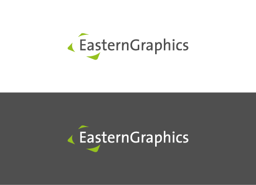
Classic versions: grey font on light background and white font on dark background with green accents on the tagline “visualize your business” and the arrows
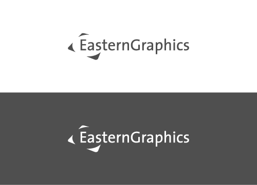
Monochromatic versions: grey on light background and white on dark background
Color palette
Make sure that the colors are correct. Use HEX or RGB for digital and CMYK for print.
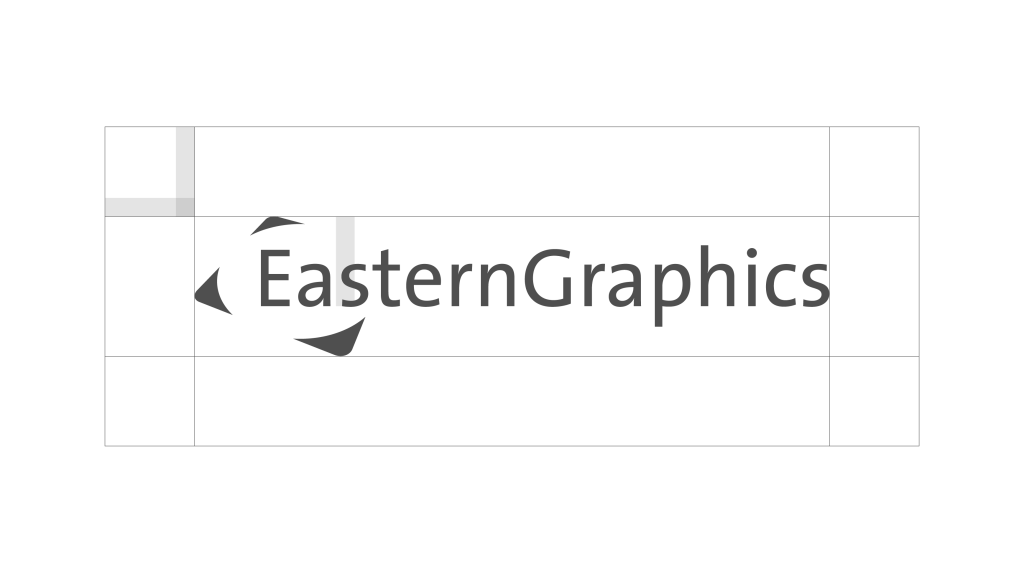
A logo needs an appropriate amount of space around it in order to visually stand out and function as intended. We refer to this as clear space. Avoid putting any text or graphics within the clear space.
Lorem ipsum dolor sit amet, consectetur adipiscing elit. Ut elit tellus, luctus nec ullamcorper mattis, pulvinar dapibus leo.
Minimum size
What is the minimum size for each use case? The distinction between digital and print usage is important.
Digital
Print
Readability
Contrast ratio: 2.00:1 or higher. If you are not sure, please check here.
White Contrast ratio: 2.11:1
Grey Contrast ratio: 1.31:1
Black Contrast ratio: 9.92:1
Co-branding
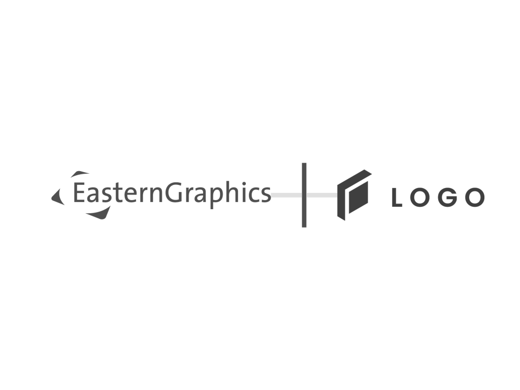
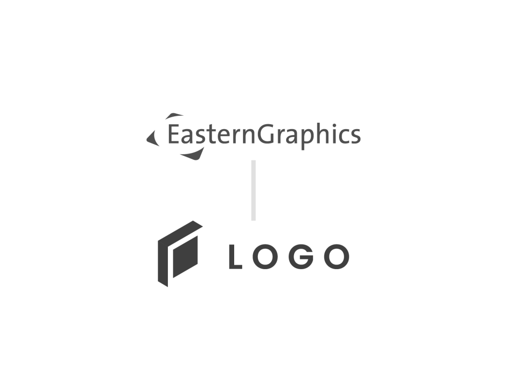
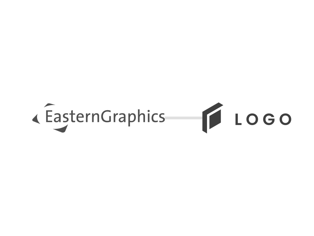
If using the logo in a bigger group make sure it is placed correctly.
Minimum space after the line is the same as in clear space.
If another logo is placed below make sure the distance is bigger.
If another logo is placed next to it make sure the distance is bigger.
Avoid
Kindly request that the following visualizations of the pCon logo be avoided.
Do not change the shape or aspect ratio of the logo.
Do not add effects like shadow or glow.
Do not change the colors of the logo.
Do not put it on busy background.
The wording under the logo is exclusive to the tagline “visualize your business”.